Response to my Auckland Train Signage rant

Well, I received a response from Auckland Transport about my Auckland Train Signage FAIL post. Unfortunately it wasn’t very helpful as they merely (and carefully) explained how the signs are going to work and why they removed the scrolling list of stations:

Thank you for contacting Auckland Transport regarding the new Real Time boards to be installed across the Auckland public transport network.

Your comments were forwarded to the Customer Information team who have provided the following feedback.

The decision to remove the scrolling message underneath the destination information as seen on the current Real Time boards, was made to allow enough room for the next two services to be displayed (rather than just the next one) and moves closer towards emulating a ‘metro’ or ‘national’ style service.

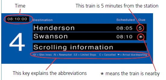
If you look at the bottom of the board, you will see information to explain the abbreviations that may appear on the screen.  These abbreviations will appear next to the destination name to advise the customer which key station the service is travelling via which will also allow customers to identify the line.

For example Papatoetoe/ GI would indicate that this service is travelling to Papatoetoe via Glen Innes on the Eastern Line, or Papatoetoe/ N would indicate that the service is travelling on the Southern line via Newmarket.

I trust his information is of use.

Thank you once again for taking the time to contact us and for your support of Auckland Transport.

Clearly they missed the point of my post which was: JUST PUT THE FRIGGING NAME OF THE LINE IN THE DISPLAY. The signs will be a million times better and you won’t need to add cryptic abbreviations nor require a traveller to have area and train network knowledge to figure out which train to catch.

My response to AT:

Thanks for the response,

Whilst I appreciate that the removal of the scrolling message frees up an additional line for information, I believe that adding /GI or /N, to the name of the terminating station, to indicate the line is counter intuitive and is certainly not in keeping with a ‘metro’ style service.

Surely it would be far better for the signs to read EAST – Papatoetoe or  _SOUTH – Papatoetoe_  (or perhaps EST Papatoetoe or STH Papatoetoe if space is an issue) ?

Using /GI or /N:

a) requires a key so that the user can figure out what the abbreviations mean

b) area knowledge to understand what/where Glenn Innes & Newmarket is

c) knowledge of the rail network to know that you need to take the train that goes via GI if you want the Eastern line and the train that goes via Newmarket if you want the Southern line.

Which is pretty useless for first time travellers and tourists.

Cheers


Auckland Train Signage FAIL

I’m an avid user of the trains in Auckland. It takes me 20 minutes to get from my house to downtown (and that includes a 8 minute walk) which sure beats getting stuck in rush hour traffic.

But one thing that has been driving me crazy for a long, long time now is the poor quality of digital signage. In it’s current state it is awfully confusing for first time travellers which why (with the RWC looming) I was pleased to hear that MAXX was investing in some new real-time signs.

Alas it appears seems that the new signs will actually be a gigantic step backwards :(

First some context. The Auckland rail network currently has 4 main lines, as shown in this very nice network map (click to enlarge it):

Each line is assigned a name (Eastern, Southern, Western, Onehunga) and nice distinct colour (yellow, red, green and blue). All very straightforward and very familiar to anyone who has seen the London underground or NYC subway maps.

Now a peculiarity of the Auckland network is that a number of lines have stations in common, in particular the Eastern and Southern lines, which share 12 stations. This is where things start to unravel…

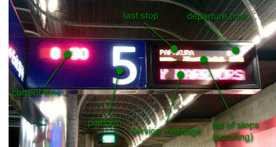
The current platform signs at Britomart look like this (apologize for the poor image quality):

Now if you look closely you will notice that NOWHERE on the board does it mention the train line! In fact since both the Eastern and Southern lines can terminate at Papakura the only way to tell which line you are on, is to watching the scrolling list of stops to see if the train is going via Glen Innes (Eastern Line) or via Newmarket (Southern Line). The problem is further compounded by the fact that trains on these lines may terminate at Otahuhu, Papakura or Pukekohe…

Imagine how confusing this is for first time travellers and tourists! They look at the nice network map figure out that they want the Eastern line and then when they get to the platform there is no mention of the line anywhere. Instead they need some area knowledge to figure out they want the train that is going via Glenn Innes, this is just awful.

The fix of course if pretty simple; just display the name of the line on the sign; Duh.

So you could have:

  • STH – Papakura
  • EAST – Papakura
  • STH – Otahuhu
  • WEST – Swanson
  • ONE – Onehunga

In fact this is what they do on the MAXX website when you search the train timetables and this is what I was hoping to see on the new signs….

This morning I was handed the MAXX/Auckland Transport’s On Board leaflet which, on pages 4 and 5, raves about the new real time information boards that are getting put in place. Here is the mock-up of the board from the leaflet:


Words cannot explain how crap the new sign’s design is.

First off the line name is still not displayed but worse the scrolling list of stations has now been dropped. Instead you have now have abbreviations (/GI, /N /LS) and you need a frigging key to explain them… seriously ? Clearly they let some of us techies loose on solving the “real-time” problem and gave no thought on making the sign actually useful.

Hopefully someone from AT or MAXX will see this post and come to their senses (or better yet if you know someone working on this project, pass them this link).

/RANT DONE – that feels much better

_UPDATE: I got a response from AT about this post_


Auckland Traffic Cams

_Updated: I’ve corrected the link and the 3D maps seems to have disappeared._

Someone just sent me a link to an Auckland traffic site. It shows a nice 3D map of the region and highlights the traffic state on the main routes.

If you click on the little “C” icons you also get an up-to-date webcam shot. Pretty nice.