Fun with Auckland bus data
A couple of days ago I discovered that Auckland Regional Transport Authority (ARTA) make all of their bus schedule data available for download from the maxx.co.nz site. The data is in the Google Transit Feed format, which means that it consists of a bunch of comma separated value text files, describing things like stops, routes, trips and calendars.
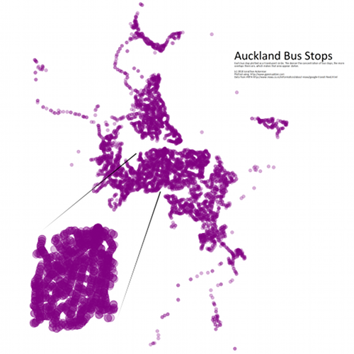
I decided to see what I could do with this data. Below is my first attempt. It is a “density” map of all the bus stops in Auckland.
Click here for a hi-res version that allows you to pan and zoom.
The initial version of the map only took about 30 minutes to create but I have spent a few hours tinkering with it since then.
Quick guide
Here is quick guide to the process if you want to try something like this yourself:
- I extracted stops.txt from the data set
- I then gpsvisualizer.com to plot out the stops as data points on map. I got it to output a 4096 pixel wide .svg file
- Next I used Inkscape to edit the .svg file, adding the text & zoomed area and exporting the result as a .png file.
- Lastly I used the Google Maps Image Cutter to generate the pannable and zoomable version. The Google Maps Image Cutter is a pretty neat tool. It takes any big image, chops it into different resolution tiles and then spits out some html which uses the Google Maps API to view your chopped up image.
Next steps
If I get some more time I will try create some more visualizations. I’m thinking it would be interesting to merge the bus stop density data with some population data. Also an animation showing 24hrs of bus movement compressed into a couple of minutes would be pretty nice too.
